Crypto Bubbles Map: the whole market as a weather map
A meteorologist doesn't read tables of temperatures — they look at a map of fronts. You can look at crypto exactly the same way: where the wind is blowing, where it's raining, where a storm is rolling through right now. This guide covers what separates a bubble map from a heatmap and a treemap, how to read market breadth straight off the colors, and what Bitcoin's enormous circle in the middle really means.
Why the market reads better as terrain than as a table
Crypto is a few thousand assets repricing every second. No human being processes that as table rows — and yet most sites still serve the market exactly that way: a ranking, eight columns, pagination. A map does something fundamentally different. It turns numbers into terrain. Large assets become mountain ranges, small ones become foothills; green and red show which region is sitting in sunshine and which one has a storm front moving over it.
That isn't a cute metaphor, it's a specific property of human vision. Size, color and position are handled by what perception researchers call preattentive processing — your visual system sorts them out before you consciously start "reading." That's why on a board of a thousand coins the anomaly finds you, while in a table you'd have to go hunting with sorts and filters. Where the underlying numbers actually come from, and how often they refresh, is the subject of our guide to market data APIs; here we're concerned with what to do with the finished picture.
One caveat up front, in the spirit of an honest audit: a map is a view of aggregates. It shows market caps and percentage changes. It does not show liquidity, order-book depth, or who is behind a move. There's a whole section below on what the map cannot see, because that matters just as much as what it can.
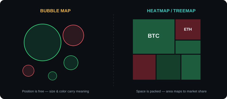
"Market map" is a family, not a single tool. The three most common variants encode the same two facts — market cap as size, price change as color — but they lay them out completely differently, and their strengths and weaknesses fall straight out of that layout.
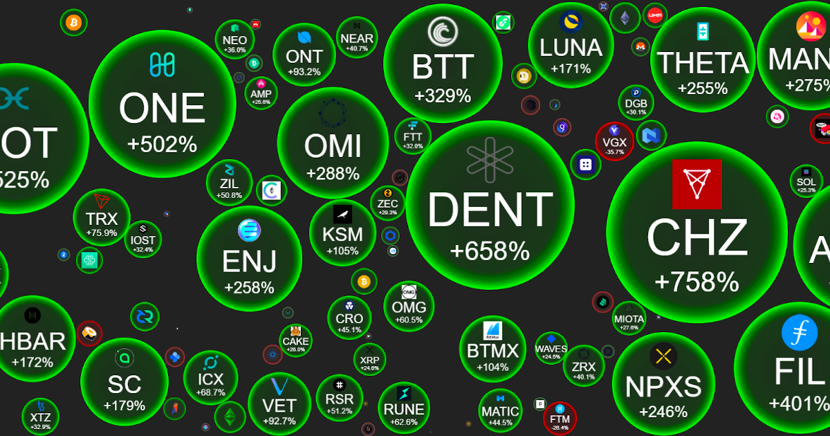
A bubble map — the Crypto Bubbles style — gives every coin a free-floating circle. The bubbles push each other apart in a physics simulation, so even a small coin keeps its own distinct shape. The result is the best scanning instrument on the market: an outlier flares like a signal rocket whether it's a giant or a minnow. The price of that legibility is wasted space between circles, and the fact that comparing the exact ratio of two circles is perceptually harder than comparing two rectangles.
A treemap packs the market into adjacent rectangles, usually sorted from largest down, so the whole thing forms a tightly tiled wall. It's the best view for the question "what share of the market does X hold?" — the areas sum to the whole, so proportions read directly. The drawback is the mirror image: anything outside the top fifty turns into an unreadable sliver at the edge, and an anomaly inside a tiny tile simply disappears.
A heatmap in the strict sense is a grid of equal cells where only color does the work (in practice the word gets used interchangeably with treemap). Equal tiles give every coin the same amount of attention — excellent for judging market breadth, useless for judging scale: a memecoin ranked #100 looks identical to Ethereum.
Criterion
Bubble map
Treemap
Heatmap (grid)
Spotting anomalies
Excellent — outliers flare regardless of size
Weak outside the biggest tiles
Good — every coin gets an equal cell
Comparing market share
Approximate — circles are hard to compare
Best — areas sum to the whole
None — size carries no information
Visibility of small coins
Good — each one has its own bubble
Poor — slivers at the edge
Very good — equal tiles
Use of screen space
Wasteful — gaps between circles
Maximal — 100% of the area
Maximal
Meaning of an element's position
None — physics, not ranking
Sort order
Usually rank order
Best used for
The daily scan and hunting for movement
Structure and dominance analysis
A fast read on market breadth
The practical takeaway: this is not a contest with one winner. Bubbles for scanning, treemap for proportions, grid for breadth. Crypto Bubbles picked option one — and for the everyday question of "what's going on?" that's the right call.
If position means nothing, why do the bubbles drift around?
Because the layout is decided by a physics simulation, not by rank. Every bubble is a body in a simple engine: it repels its neighbors, seeks free space, and drifts whenever it changes size. After a data refresh the same coin can end up in a different corner of the screen — and that's fine, because only size, color and the label carry information. The motion is purely ergonomic: a living board is nicer to work with and it stops circles from overlapping. A classic beginner mistake is reading meaning into the fact that "coin X is sitting next to Bitcoin." It isn't next to anything. Physics just shoved it there.
Color intensity is a second data channel
Most people register only the hue: green up, red down. The saturation carries a second layer. A pale green bubble is a coin up half a percent; a screaming green one is up twenty. Once you start reading intensity, a board stops being binary and becomes a gradient — and you can rank the day's movers by brightness without touching a single number. Two boards can be almost identically green and describe completely different days: one drifting quietly upward, the other in a full melt-up. Same colors, different volume knob.
Workbench
Filters: from a thousand coins to a board you can actually think about
The full map is impressive, but for real work you usually want a narrower frame. The app lets you cut the view several ways — according to the official cryptobubbles.net site, rank brackets, search and watchlists are all available:
Rank brackets (the top 100, the next hundreds, out to a thousand). The first hundred is the "main market" — relatively liquid, watched by everybody. The deeper hundreds are the frontier: more opportunity, more wreckage, far less liquidity. Comparing how the first hundred behaves against the fifth is instructive. A rally that has reached the fifth hundred is a rally in its euphoria phase.
Search — type a ticker and the board highlights that coin. Trivial, but faster than any table.
Watchlists — your own map of the 10 to 15 coins you actually understand. This is the healthiest daily mode: the world's noise stays outside the door. How to build such a list sensibly is covered in our bubble chart guide.
Coin coverage, filters and watchlists — according to the official cryptobubbles.net site (as of July 2026).
Reading sectors: when bubbles move as a herd
The map's most valuable signals don't come from individual bubbles, they come from groups. Crypto travels in packs: memecoins, AI tokens, layer twos, exchange tokens. When five leading memecoins turn green on the same day, it does not mean five teams simultaneously shipped a product. It means speculative capital is rotating into that sector. Rotations are crypto's daily bread — money leaves one narrative and enters another, and the map shows that flow faster than any article will.
The practical reflex: you see a green cluster, ask two questions. First, what is the common denominator of these coins (a sector? a shared investor? one exchange listing them?). Second, which phase of the rotation are we in — because a sector glowing green for the third week running is more often the end of a move than its beginning. Buying into a narrative that has already gotten loud is buying tickets to a screening that's rolling the credits.
There's a useful sanity check here that costs nothing: compare the cluster on the day window against the week window. If the daily is bright and the weekly is pale, something started recently. If both are bright, you're late — and if the daily is red while the weekly is still green, you may be watching the first exhale of a trend that's rolling over.
Market breadth: count the colors before you believe the index
Here's the most underrated skill a map gives you: reading market breadth. Indexes and headlines say "the market is up 2%." The map answers a more important question: how many coins are actually up? Because "the market is up" can mean two radically different things. The healthy version: 70–80% of the board in various shades of green — capital flowing broadly, the whole market participating. The suspicious version: two or three huge green bubbles surrounded by hundreds of small red ones — a handful of giants dragging the index while everything else bleeds. Identical index print, completely different market health.
Equity analysts compute advance/decline lines for exactly this. You get the same thing in one look at the board's color balance. A red sea with one green island, a green sea with red patches, a mottled stalemate — each of those is different weather and a different conversation about risk. Breadth can also lead: when the index is still climbing but there's visibly less green on the map day over day, the move is narrowing — and narrowing rallies have historically ended worse than broad ones.
Dominance: what Bitcoin's giant circle is really saying
The first thing every new user notices is that Bitcoin is enormous. Its bubble would swallow dozens of top-100 bubbles — and that disproportion isn't a scaling bug, it's the most honest lesson available about how this market is structured. BTC's share of total crypto capitalization (its dominance) has hovered around half the market for years, and the map turns that abstract number into something you simply see.
Changes in that ratio are a barometer of their own. When Bitcoin's bubble grows relative to the rest of the board, capital is retreating into the (relatively!) safest asset in the asset class — the market is playing defense. When dominance melts and altcoins go green as a herd, risk appetite is rising; historically those stretches got called "alt seasons." Watch out for one interpretive trap: dominance can rise either because BTC is climbing faster or because altcoins are falling harder. The ratio alone doesn't tell you which; always check the colors on both sides of the board. And if you want to feel the scale of those proportions in actual numbers, run a few scenarios through the CoinCompare calculator.
A broad rally day: green in every bubble size. That picture says more than the index print does.
Case study: one day, one board, a full diagnosis
Let's put it together. You open the map on the day window and see: Bitcoin +1.8%, pale green. Ethereum +0.9%. But lower down, a cluster of five AI tokens is glowing +15% to +30% — the brightest points on the board. The rest of the market? Mottled around zero, slightly more red than green. Four-sentence diagnosis: the market as a whole is flat (breadth neutral, faintly negative); the giants are not participating; all the momentum sits inside one narrative, AI; this is textbook sector rotation, not a bull market.
What next? You switch to the week window: the AI cluster has been lit up for four days and its leaders are already +80% over seven days. The cynic's conclusion: you are not early, you are in the middle — possibly the late middle — of a local mania. You click into two of the leaders' coin cards: volume is high, but yesterday's price high hasn't been taken out. Whatever you decide, the decision itself gets made on an exchange, with an order book and candles in front of you. The map did its job: out of a thousand coins it pointed at five worth a look and warned you the party started a while ago. The whole chain of reasoning took maybe four minutes.
Tip: screenshot the map at the same time every day. After two weeks you have your own time-lapse of the market, and rotations and breadth shifts show up in it better than in any indicator.
A three-minute daily routine that actually sticks
Tools only pay off when they become a habit, and habits need to be short. Here's a routine that fits into the time it takes coffee to cool. Minute one: open the day window on the full board and answer one question — what's the ratio of green to red? Say it out loud in plain words ("mostly green, giants flat"). Minute two: find the three brightest bubbles and the three darkest, and check whether they cluster into a sector. Minute three: switch to the week window and ask whether what you just saw is new or old news. That's it. No note-taking, no indicators, no predictions.
What makes this work is that it's the same three questions every day, so you build a mental baseline. After a month you'll know what a boring day looks like on your board — and knowing boring is what lets you recognize genuinely strange. Analysts pay for volatility dashboards to get the same instinct.
Five ways people misread a market map
Most map mistakes are interpretive, not technical. The recurring ones, from most to least common:
Treating green as a forecast. Color is a record of the past. "It went up" and "it will go up" are different sentences, and the map only ever writes the first one.
Confusing a big bubble with a safe bubble. Size is capitalization, not quality and certainly not downside protection. Large caps fall too, just with more company.
Chasing the brightest bubble on the board. The single most extreme mover is, by construction, the least representative data point on the screen. It's often a thin market with one buyer.
Reading meaning into layout. Clusters of position are noise from the physics engine. Clusters of color are the signal.
Using one time window only. A board read on a single timeframe is half a sentence. Two windows turn a snapshot into a direction.
The limits of the map — what you won't see with the sharpest eye
A map is only as good as the data it aggregates and only as honest as the person reading it. A few hard limits worth tattooing on the inside of your eyelids. Liquidity: market cap is not money you can withdraw; a small bubble can be a market with no exit door. Volume and its quality: the map cannot separate organic turnover from wash trading. Causes: a green cluster doesn't say whether it's a product, a rumor or a coordinated pump. Selection: the board shows coins that are already large — the earliest phase of a project happens off-map, and so does its most common ending, a quiet death. The map is an excellent first step and a terrible last one. Treat it like a weather forecast: helpful for deciding whether to take an umbrella, not a substitute for looking out the window. If bubbles as a concept are new to you, start with what Crypto Bubbles actually is, then check the app download guide to get the board onto your phone.
The short version of this page
A map turns the market into terrain: size = market cap, color = change. A bubble's position means nothing — that's physics, not ranking.
Bubbles win at spotting anomalies, treemaps at comparing shares, grid heatmaps at reading breadth. Pick the tool that matches your question.
Breadth beats the index: count the green-to-red ratio before you believe a "market is up" headline.
A green cluster is capital rotating, not five miracles at once — and you're usually later into it than you think.
The map shows no liquidity, no causes, no manipulation. A radar, yes. A crystal ball, no.
FAQ
Frequently asked questions about the market map
How is a bubble map different from a heatmap or a treemap?
All three encode market cap as size and price change as color, but they arrange things differently. Treemaps and heatmaps pack the market into adjacent rectangles — great for comparing shares of the whole, but small coins vanish into slivers at the edge. A bubble map gives every coin its own free-floating circle, so an outlier jumps out no matter how small it is. Bubbles win at scanning, rectangles win at measuring proportions.
Does a bubble's position on the map mean anything?
No. The layout comes out of a physics simulation — circles push each other away and settle into free space, so the same coin can sit somewhere else after every refresh. Only size, color and the label carry information. That is the key difference from a treemap, where position reflects sort order.
What does Bitcoin's giant bubble in the middle actually tell me?
It is BTC dominance made visible — Bitcoin's share of total crypto market capitalization. When its bubble grows relative to the rest of the board, capital is hiding in the largest asset; when it shrinks, money is flowing out toward altcoins. That shifting ratio between BTC and everything else is one of the oldest risk-appetite barometers in the market.
What is market breadth and how do I read it off the map?
Breadth is the ratio of rising coins to falling ones, and the map shows it as the ratio of green to red across the whole board. A market where 400 of 500 coins are up is healthier than one where two megacaps drag the index higher while everything else bleeds. One glance at the color mix tells you more than the index print does.
Does a bubble map show the entire crypto market?
No — and that is a feature. According to the official cryptobubbles.net site the view covers more than 1,000 of the most significant coins, with filters by rank bracket. The tens of thousands of remaining tokens are mostly dead or illiquid projects that would only add noise. Just remember that the earliest phase of any new project happens off the map entirely.
Is a market map useful for day trading?
As a radar, yes. As a decision tool, no. The map is excellent at showing where attention and capital are flowing today, but it has no order book, no market depth and no candlestick chart. Executing a trade needs an exchange platform; the map only suggests which coins are worth a closer look.
The map pointed you somewhere. The rest happens on an exchange.
Breadth, rotations and dominance tell you where to look — but the order book, the candles and real liquidity live on a trading platform. Pick a regulated exchange, turn on 2FA, and test your diagnoses with small size first.