Crypto bubbles chart: learn to read the board like a pro
Size, color and five time windows — trivial on the surface, and in practice a tool most people read wrong. Here's what each element actually says, why the same coin can be green and red at once, and how to get more out of three minutes on the board than most people get from an hour of scrolling.
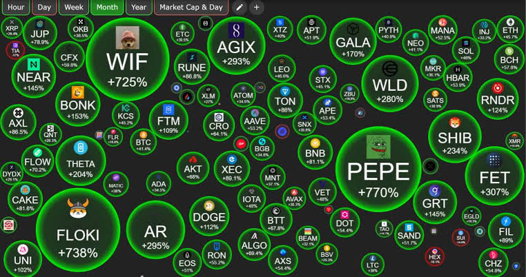
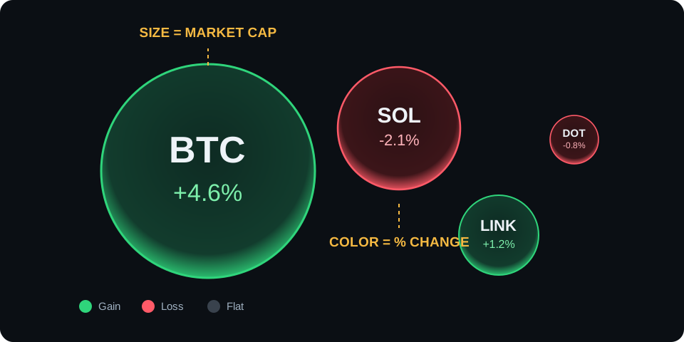
The bubble chart is radically simple — which is exactly why it's so easy to overrate or misread. Each bubble carries precisely three pieces of information. Not one more.
Size = market capitalization. A bubble's area corresponds to the coin's total valuation: price times circulating supply. This is the single most important convention on the chart, because it bluntly corrects the most common beginner illusion — confusing unit price with project size. A token at $0.08 can have a bubble ten times larger than a token at $300. If that sounds counterintuitive, read our piece on the CoinCompare calculator and the "cheap coin" trap.
Color = price change over the selected window. Green is a gain, red is a loss, and saturation encodes the magnitude. A pale green bubble is up a fraction of a percent; a vivid one is up double digits. Watch the psychology here: the eye is dragged toward the most saturated colors, and those are usually the most overheated — which is to say the riskiest — corners of the market.
Label = ticker and change figure. Each bubble shows the coin's symbol (BTC, ETH, SOL…) and its percentage change. Small bubbles only reveal their label on hover or tap — the board deliberately trades detail for overall legibility.
The chart's entire grammar in one image: size says "how big", color says "what happened".
And that's it. The bubble chart does not show volume, liquidity, holder counts or sentiment — you'll find those after clicking a bubble, or entirely outside the app. Treat the board like newspaper headlines: they tell you where to look, but you still have to read the article.
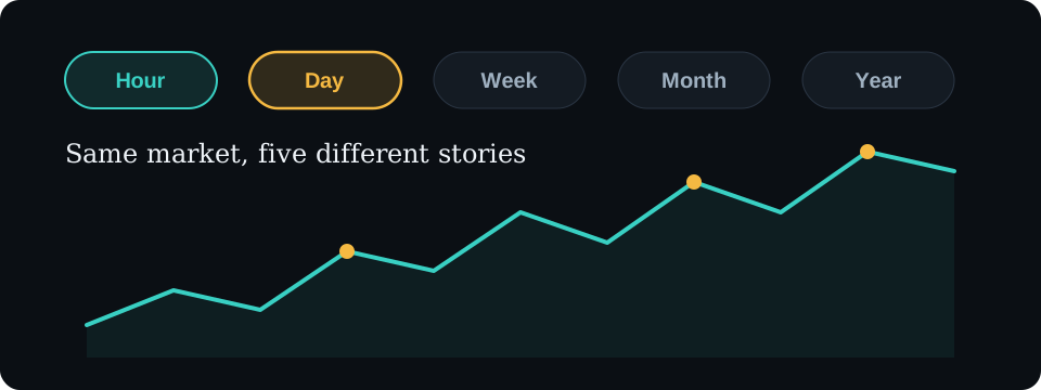
The time-window switch is the most powerful — and most ignored — control on the chart. According to the official site cryptobubbles.net, the board offers views from one hour up to one year. The crucial thing to understand is that these are not "the same thing, only longer". Each window answers a different question and carries a different trap.
From pulse to X-ray: the longer the window, the less emotion and the more structure.
Hour: the market's pulse
The hourly view is pure heartbeat — micro-moves, reactions to individual orders, algorithmic noise. It's useful in exactly two situations: when something violent is happening right now (a flash crash, a breakout after news) and you want to see what's reacting hardest, or when you're actively trading and need to know where attention is flowing this minute. Otherwise? Hourly colors are a lottery. A coin that's green at 2 p.m. can be red at 3 p.m. for no reason anyone could name.
Day: the session's balance sheet
The 24-hour window answers "how was the market's day?". It's the default view for most users and a reasonable starting point — provided you remember its weakness: a day is still too short to separate a move from a trend. A single session can look like the start of a bull run or the end of the world while being nothing more than an ordinary bounce.
Week: a trend that has had to survive something
Our favorite window for regular reviews. A weekly change has already lived through a weekend, several Asian and US sessions, and at least one wave of panic on social media. If a coin is green on the weekly view, there's usually more behind the move than one tweet. This window strikes the best balance between how fresh the information is and how much you can trust it.
Month: narratives and rotations
On the monthly window you stop seeing individual coins and start seeing stories: the gaming sector catches a tailwind, memecoins cool off, Ethereum layer-two tokens rise as a herd. Here the question you're answering is "which part of the market has momentum right now?" — and the group patterns we dig into in our market map guide become impossible to miss.
Year: the survival test
The yearly view is an X-ray with built-in irony: it shows who genuinely built value and who merely flashed. But it has a subtle flaw almost nobody mentions — survivorship bias. The board only shows coins that still have enough market cap to be on it. The ones that fell 99% and dropped out of the ranking simply vanished from view. That makes the yearly board look kinder than reality was.
One coin, four different truths — a walkthrough
Picture a token called L2COIN (the name is invented, the mechanics are not). You open the hourly window: +1.2%, pale green, boring. Switch to the day: +14%, vivid green, one of the brightest bubbles on the board — someone announced a partnership. The week: −8%, red; yesterday's spike is only patching the hole left by last week's token unlock. The year: −71%, deep red; the project is a shadow of its euphoria-era valuation. Four windows, four true answers. Whoever looked only at the daily green "bought the partnership" — without noticing they were buying a falling knife mid-bounce. Hence the iron habit: never judge a coin from a single time window.
Tip: the most interesting signals live in the disagreements between windows. A coin red on the month but green on the week? Possibly a slowdown in the decline. Green on the year, red on the week? A correction inside a trend. The divergence itself proves nothing — but it tells you where digging is worth the effort.
Reading color intensity without fooling yourself
One more subtlety about color, because it trips up careful people too. Saturation is relative, not absolute. On a quiet day when nothing moves more than 3%, the board rescales and a +2.5% coin can glow like a champion. On a violent day, that same +2.5% barely registers as a tint. So before you interpret any single bubble, take half a second to read the board as a whole: is this a day of ±2% or a day of ±25%? The answer changes what "bright green" means. Screenshots circulating on social media almost never include that context, which is precisely why they're so persuasive and so useless.
Practice
Clicking a bubble: the coin card, where research actually starts
The board is a table of contents; the coin card is the first paragraph. Tap or click a bubble and you get a miniature dossier: a price chart for the selected window, market cap, trading volume, ranking position and links to further sources. Check two things there reflexively. First, the relationship between the gain and the volume. A 30% move on negligible turnover is a balloon inflated by a handful of wallets — it pops at the first pinprick. Second, the shape of the price chart. Even stair-steps upward look nothing like a vertical candle printed at 3 a.m. after which price just sits there. That second signature is often a pump, not demand.
Three routines that make a difference
The three-minute morning scan
Open the daily window: which color dominates? Eyeball the ratio of green to red — that's a quick measure of how broad the move is. Switch to the week: does today's picture confirm the trend or contradict it? Finally, find the two biggest outliers and check on their cards whether volume backs the move. That's all. Three minutes and you know more about the market than an hour of scrolling social media would tell you.
Anomaly hunting
An anomaly is a bubble behaving differently from its neighbors: the only green coin in a red sector, a small token glowing brighter than the entire board. The anomaly means nothing by itself — it's an invitation to ask "why?". The answer is often boring (an unlock, a delisting, liquidity moving venues) and occasionally interesting (a real product, real adoption). Telling those apart requires research outside the bubbles, and that research is the actual job.
Watchlist hygiene
The full board is great for orientation, but daily work happens on a watchlist. The rules: 10–15 positions maximum, only coins you can explain what they are and why they exist, a review once a month, and ruthless removal of anything you're keeping out of sentiment. A watchlist is a portfolio of attention — and attention, like capital, does badly when it's spread too thin.
What the bubble chart won't tell you — the honesty section
Auditing is our day job, so we're allergic to tools sold as crystal balls. The bubble chart isn't one, and it's honest about its limits — provided you're willing to see them:
Liquidity. Market cap is price times supply, not a measure of how much money you could actually extract from the market. A token valued at $200 million can have an order book so shallow that selling $20,000 worth drops the price several percent.
Tokenomics. Unlock schedules, supply concentrated in a few wallets, emissions that swallow every rally — none of it shows up in a bubble's color, and each can decide the fate of a position.
Manipulation. A coordinated pump looks identical to organic demand on the board: green. Wash trading can manufacture "volume" for any piece of nonsense. The chart records the effect, never the intent.
The future. The most banal and most important one: color describes the past. A green bubble is not a buy signal, it's a report on what already happened — often a report about an opportunity that has just closed.
Note: if you catch yourself thinking "I'll buy it because it's very green" — stop. Buying by color is buying after the move, statistically the most expensive beginner habit there is. The board is supposed to suggest where research begins, not replace it.
Bubbles plus candles: the complete toolkit
The bubble chart and the candlestick chart aren't competitors, they're the two ends of the same funnel. Bubbles answer "where should I look?" — they scan a thousand coins at once and surface the ones doing something unusual. Candles on an exchange answer "what exactly is happening there?" — they show the structure of the move, the levels, volume over time, order book depth. A sensible workflow runs like this: anomaly on the board → coin card (volume, shape of the move) → fundamental research (what is this project, actually) → and only then a candlestick chart on an exchange, if you're seriously considering a position. Every stage eliminates candidates, which is the point. Out of ten glowing bubbles, nine should drop out along the way.
A concrete example of the funnel doing its work: say four small-cap tokens are up more than 25% on the daily view. Card one shows volume up tenfold alongside the price — plausible, keep it. Card two shows a 30% gain on volume that hasn't changed since last week; that's a thin book being walked upward, discard. Card three has a vertical candle followed by a flat line, the classic pump signature, discard. Card four turns out to be a coin whose supply doubled last month, so the "gain" is partly an artifact of a re-listing, discard. One survivor out of four, and you spent six minutes instead of six hours.
Cheat sheet: window → question → trap
Window
Question it answers
Main trap
Hour
What's happening right now? Where is attention?
Noise impersonating signal; colors flip for no reason
Day
How did the session go? What's leading today?
One day isn't a trend — emotional "today only" decisions
Week
Does the move have continuity? What survived the swings?
Still too short to judge a project, long enough to judge momentum
Month
Which sectors and narratives have momentum?
Entering a narrative at its tail end, once green has lured everyone in
Year
Who actually built value? Who just flashed?
Survivorship bias: the failures leave the board and understate the risk
The range of time windows and the data refresh interval — per the official site cryptobubbles.net (as of July 2026).
If you're just getting started with the app, our installation guide covers how to get it safely onto your phone and desktop, and "What is Crypto Bubbles" explains where the whole project came from and why it works on the brain so well. If you're curious about the plumbing behind the data, head to the API and data guide.
The short version of this page
A bubble carries three facts: size = market cap, color = price change, label = ticker. Nothing else.
Each time window answers a different question: the hour is a pulse, the week is a trend, the year is a survival test (with survivorship bias).
Most of the information lives in the disagreements between windows — never judge a coin from one view.
The board shows no liquidity, no tokenomics, no manipulation. Green is a report on the past, not a buy signal.
The complete toolkit: bubbles as radar, the coin card as filter, an exchange candlestick chart as the magnifying glass.
FAQ
Frequently asked questions about the bubble chart
What exactly does bubble size mean on the chart?
Market capitalization — the unit price multiplied by circulating supply. Not the unit price! A coin trading at $0.10 can have a bigger bubble than a coin trading at $500 if its total valuation is higher. Bubble area scales with market cap, which is what makes the market's proportions visible at a glance.
Why is the same coin green on the daily view and red on the yearly one?
Because each window measures change from a different starting point. Up 5% today and down 60% since last year are two true statements about the same coin. That is why you should flip at least two windows before forming any opinion — day and week, plus the year for anything resembling real research.
Which time window is best for a beginner?
The week. The hourly view is noise, the daily one is an emotional roller coaster, and the weekly one shows a move that has already had to survive something. Once you get comfortable you will start comparing windows against each other — and most of the real information lives in those differences.
Does the bubble chart show trading volume?
Not on the board itself — there you see market cap (size) and price change (color). Volume appears once you tap a bubble and open the coin card. This matters: a big green bubble on feeble volume is a rally almost nobody backed with real money.
Can you trade directly from the bubble chart?
No. Crypto Bubbles is an observation tool — no wallet, no order book, no buy button. Trading requires an exchange account. The healthy workflow is bubbles as radar, and an exchange with candles and volume as the place where decisions get made.
How often does the chart data refresh?
According to the official site cryptobubbles.net, the board updates automatically every few dozen seconds and the data comes from public market aggregators. For watching the market that is more than enough; for precise entries and exits you will be looking at exchange quotes anyway.
You've got the radar. Now the magnifying glass
Bubbles show you where to look — decisions happen on a candlestick chart with real volume and a real order book. Pick a regulated exchange and practice the whole workflow with small amounts first.